Dashboards
The dashboards workspace contains a series of dashboards with highly interactive charts that provide a graphical representation of your organization's licensing data.
Use the Business Unit options in the toolbar to filter the information in each dashboard. Results can be displayed for the entire organization, or they can be filtered by business unit. There are six dashboards.
The Notifications Dashboard
The notifications dashboard displays information covering most areas of the License Manager database. This provides a snapshot of your compliance status and an overview of the data in your License Manager database. It also highlights any actions that are needed to address your compliance status and maintain your database.
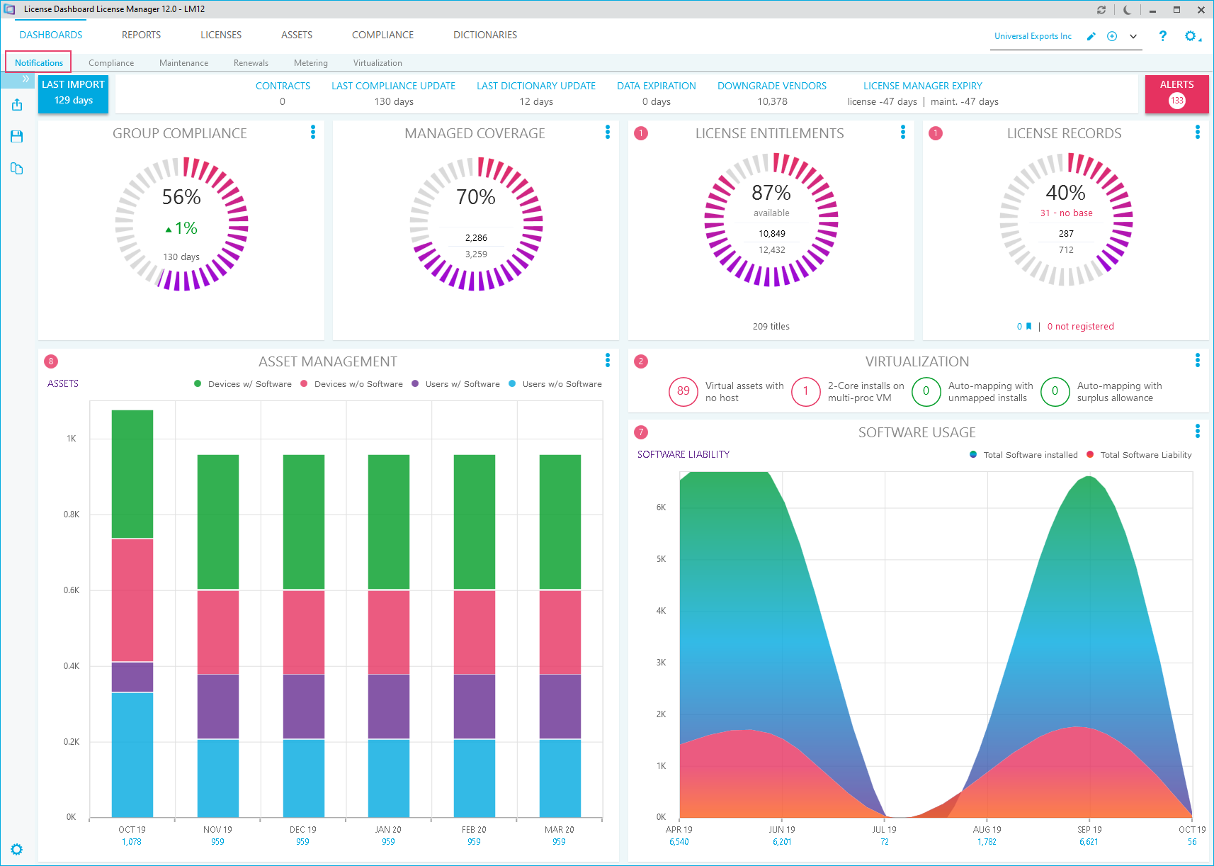
The top row of the page shows information about actions that have been taken in your database, such as the how long it has been since the last data import and compliance update, or when your License Manager key will expire. A list containing all alerts is available, click on the Alerts icon in the top right corner:
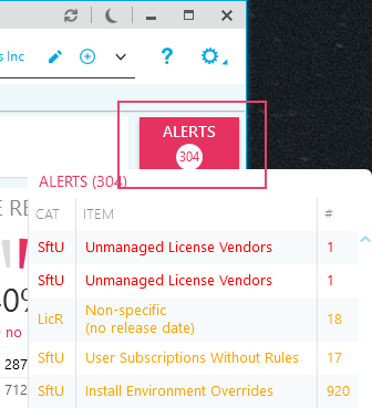
Each alert is color coded:
- Red indicates that the notification requires urgent attention
- Amber indicates that the notification requires attention, but it is not urgent
Click on an alert to launch a report or link to another part of License Manager to address the issue it is highlighting.
A series of charts are also displayed, providing a top level overview of your data in a graphical form. For example, the Group Compliance chart shows the compliance position for the selected business unit. If no business unit is selected, it shows the compliance for the entire company. The calculation gives the total number of licensed installations as a percentage of the total number of installations.
Each chart has some interactive features:
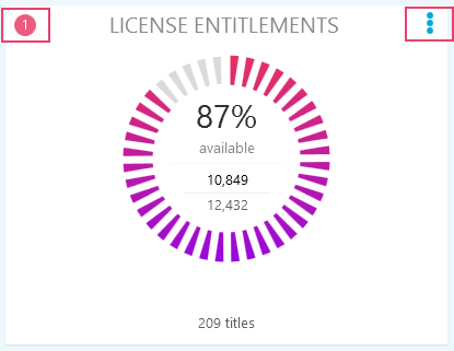
- Click on the alert icon in the top left to view any alerts relating to the chart.
- Click on the options icon in the top right to view any additional actions such as sharing the chart or launching a related report.
The Compliance Dashboard
The compliance dashboard allows you to visualize your organization's licenses and software install data in a series of interactive charts. This enables you to get an overview of your organization's license compliance status.
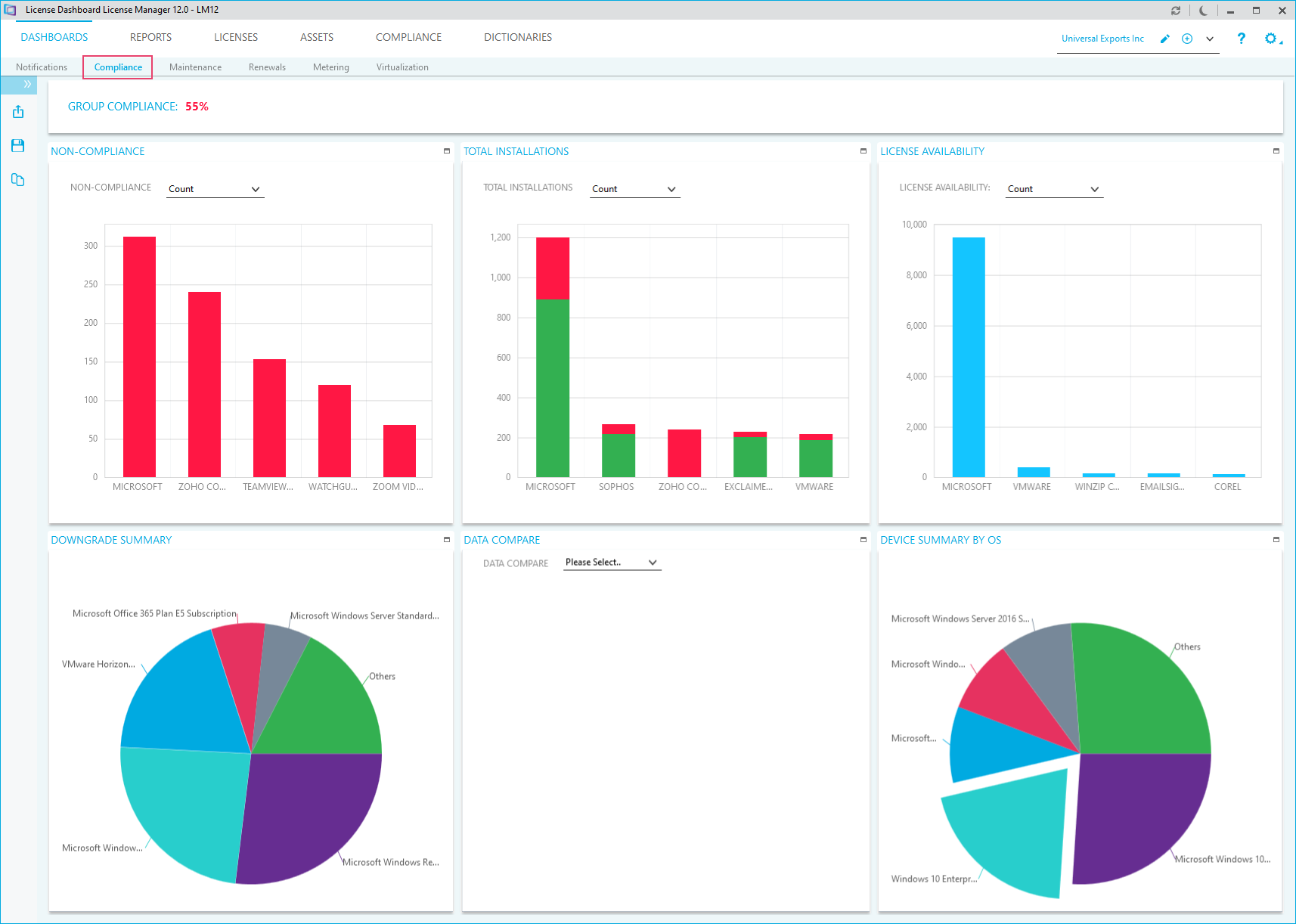
The charts available within the compliance dashboard are as follows.
- Non-Compliance is a column chart with one series showing the top most non-compliant items within the selected business unit, manufacturer, or product family. Non-compliance is shown as a percentage value, count or cost, with the items sorted in descending order by non-compliance and then by total number of installations.
- Total Installations is a stacked column chart with two series. The green series shows the total number of licensed installations within the selected business unit, manufacturer, or product family. Total Installations is shown as a count or cost. The red series shows the total number of non-licensed installations. The whole stack (red plus green) gives the total number of installations.
- License Availability is a stacked column chart with two series. The light blue series shows the total number of licenses available for allocation within the selected business unit, manufacturer, or product family. License availability is shown as a count or cost. The darker blue series shows the total number of licenses that are either reserved or on-order (i.e. unavailable).
- Downgrade Summary shows products within the selected business unit that have downgrades allocated. The top five products are shown according to number of downgrades allocated. The sixth item shows a combined total for all other products.
- Data Compare compares data from the last fully completed audit and the previous fully completed audit, filtered on the selected business unit. There are three variations of this chart, selectable using the drop-down list in the title bar.
- New Products shows products that were found in the last audit, but were not found in the previous audit. The top five products are shown according to the number of installations. The sixth item shows a combined total for all other products.
- Dropped Products shows products that were not found in the last audit but existed in the previous audit.
- New Installs shows products that existed in both audits, but for which the number of installations has increased.
- Device Summary by OS shows the number of devices in the selected business unit by operating system. The top five operating systems are shown according to number of devices. The sixth item shows a combined total for all other operating systems.
How to drill down into your data
Each chart has a different set of interactive features, for example:
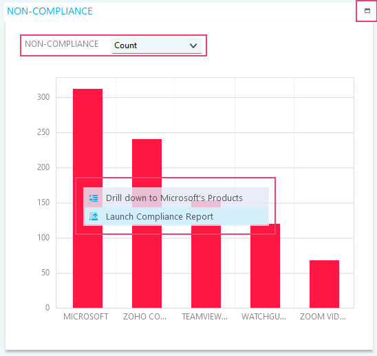
- Click on the maximize icon in the top right to expand the chart to fill the workspace. The minimize icon allows you to return to the original view.
- Some charts have additional display options, in the example above, the non-compliance chart can be shown as a count, percentage value or estimated cost.
- Left-clicking on a column in a compliance column chart allows you to:
- Drill down into the data.
- Drill back up.
- Launch reports. This provides a more detailed view of a particular business unit, manufacturer or product family.
The Maintenance Dashboard
This chart enables the user to see which maintenance agreements need urgent attention. In its default, zoomed-out position, it covers 30 days prior to the current date, and up to the date of the last maintenance expiry for the selected business unit. Points on the timeline represent individual maintenance items.
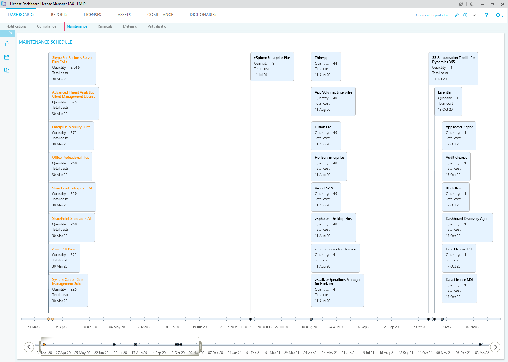
The details of the individual maintenance items are shown on flags attached to the points. Items in the timeline, and the text on the flags, use color coding:
- Red : Maintenance expires today or has already expired
- Orange: Expires in next 30 days
- Purple: Expires in next 30 to 90 days
- Black: Expires in over 90 days
How to zoom in to the Maintenance Schedule
Use the zoom and pan controls at the bottom of the page to zoom in and out:

- Click and drag the left and right zoom controls on the title bar so that the relevant period is displayed in the upper window.
- Adjust your view as needed using the left and right scroll arrows.
- To move to another area on the timeline, click and drag your selected area on the title bar to move the selection left or right.
Renewals Summary
This chart enables the user to see a projected cost of upcoming license renewals, on a month-by-month basis. The chart can be viewed as an overall cost or be broken down by vendor.
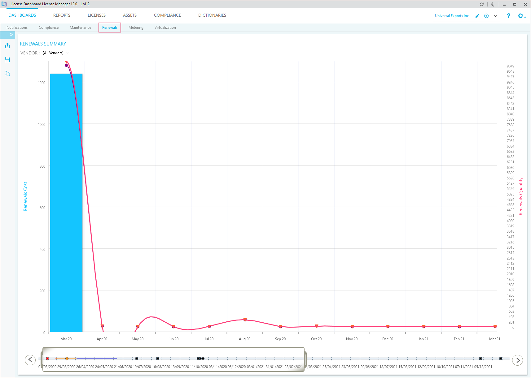
You can zoom into and pan across the data in the same way as the maintenance dashboard. See also: How to zoom in to the Maintenance Schedule.
The Metering Dashboard
The Metering Summary chart on the Metering Dashboard screen allows you to quickly visualize the most used products in your organization.
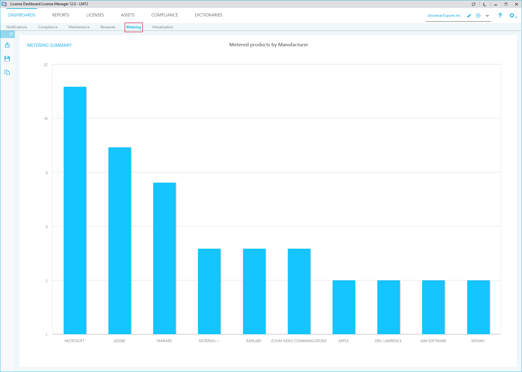
Left-clicking on any of the columns in the Metering Summary allows you to drill down into the data and launch reports in the same way as the compliance dashboard. See also: How to drill down into your data.
The Virtualization Dashboard
The virtualization dashboard allows you to display data in a way that helps you to visualize the structure of the virtualization environment in the business. You can see each data center in an organization, the servers hosted at the data center and the virtual devices hosted on each server.
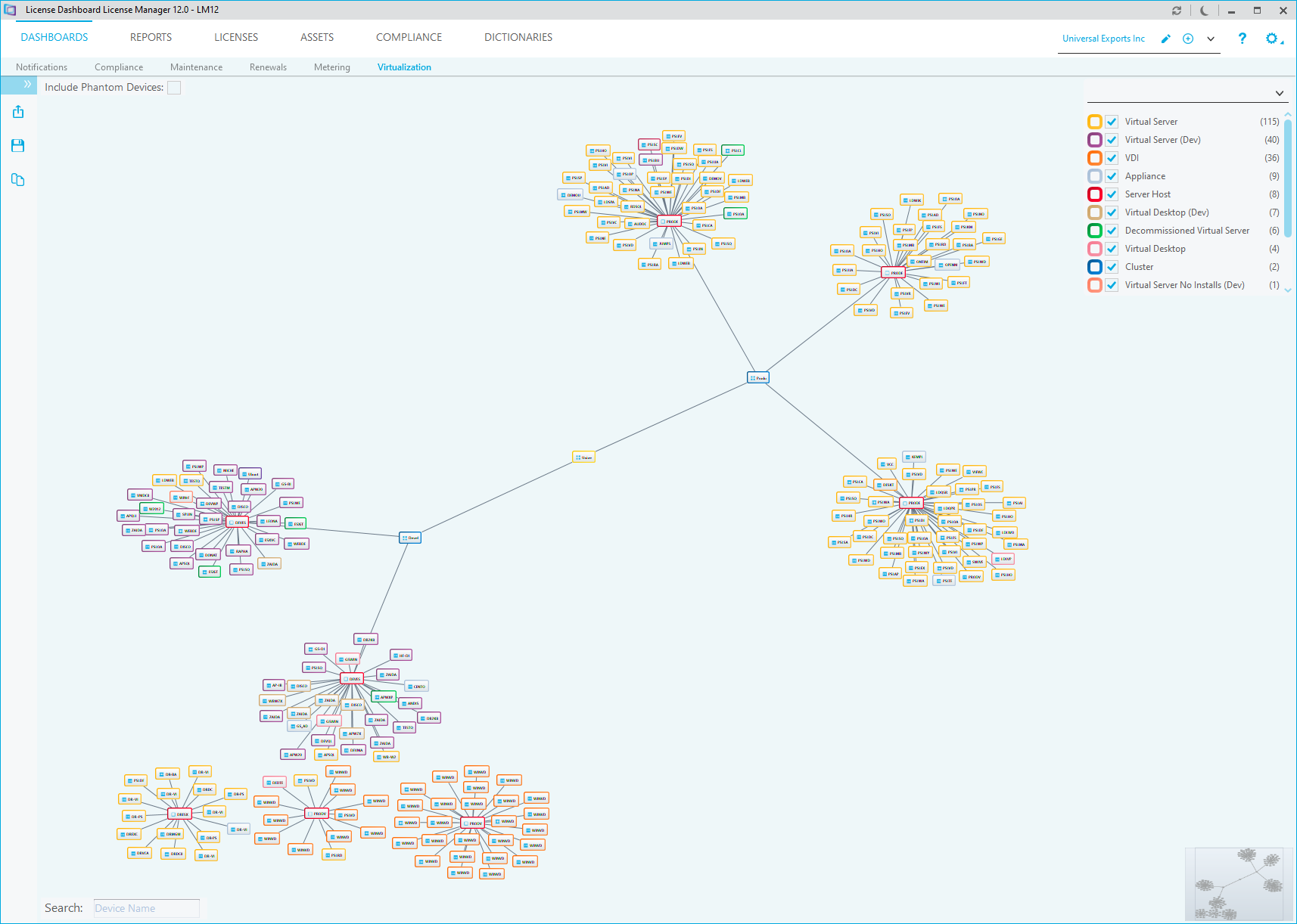
The structure of the virtualization environment is based on the latest audit run. The display can be changed to add or remove the highlights for each type of device. You can search for a specific device name and launch reports by right-clicking on a device.
The zoom controls for the Virtualization dashboard are available in the bottom right corner:
